Please note: Check the course calendar for the due date
Learning Objectives
- How to make a cumulative percentage table with statcrunch
- How to graph the table as an ogive or percentile graph
- How to analyse and interpret percentile graphs and ogives
LAB MATERIALS
StatCrunch Resources
Lab 3 Resources
Cumulative Frequency Distributions
A cumulative frequency distribution gives the total number of values that fall below the upper boundary of each class. In a cumulative frequency distribution table, each class has the same lower limit but a different upper limit. The next example illustrates the procedure for preparing a cumulative frequency distribution.Example
The total number of iPods sold per day by a company in January 2006 is summarized in the frequency distribution below. You can tell, for example, that on three days of the month the company sold between 5 and 9 devices each day; and on 6 days the company sold between 10 and 14 iPods per day. Construct a cumulative frequency distribution for the number of iPods sold. On how many days did the company sell 19 or fewer iPods? To obtain the cumulative frequency of a class, we add the frequency
of that class to the frequencies of all preceding classes. The cumulative
frequencies are recorded in the third column of table below. The second column of this table
lists the class boundaries.
To obtain the cumulative frequency of a class, we add the frequency
of that class to the frequencies of all preceding classes. The cumulative
frequencies are recorded in the third column of table below. The second column of this table
lists the class boundaries.Cumulative Frequency Distribution of iPods Sold
 We can determine the number of observations that fall below the upper
limit or boundary of each class. For example, 19 or fewer iPods were sold on 17 days.
We can determine the number of observations that fall below the upper
limit or boundary of each class. For example, 19 or fewer iPods were sold on 17 days.The cumulative relative frequencies are obtained by dividing the cumulative frequencies by the total number of observations in the data set. The cumulative percentages are obtained by multiplying the cumulative relative frequencies by 100.
Calculating Cumulative Relative Frequency and Cumulative Percentage
\[ \text{Cumulative relative frequency} = \frac{\text{Cumulative frequency of a class}}{\text{Total observations in the data set}} \]
\[ \text{Cumulative percentage} = \text{(Cumulative relative frequency)} \cdot 100 \]
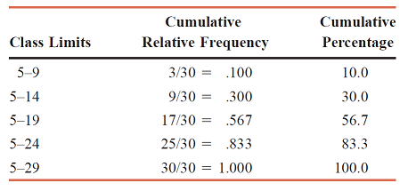
The table below contains both the cumulative relative frequencies and the cumulative percentages for Cumulative Frequency Distribution. We can observe, for example, that 19 or fewer iPods were sold on 56.7% of the days.
Cumulative Relative Frequency and Cumulative Percentage Distributions for iPods Sold
 When plotted on a diagram, the cumulative frequencies give a curve that is called an ogive
(pronounced o-jive ). The figure below gives an ogive for the cumulative frequency distribution. To draw the ogive, the variable, which is total iPods sold, is marked
on the horizontal axis and the cumulative frequencies on the vertical axis. Then the dots are
marked above the upper boundaries of various classes at the heights equal to the corresponding
cumulative frequencies. The ogive is obtained by joining consecutive points with straight lines.
Note that the ogive starts at the lower boundary of the first class and ends at the upper boundary
of the last class.
When plotted on a diagram, the cumulative frequencies give a curve that is called an ogive
(pronounced o-jive ). The figure below gives an ogive for the cumulative frequency distribution. To draw the ogive, the variable, which is total iPods sold, is marked
on the horizontal axis and the cumulative frequencies on the vertical axis. Then the dots are
marked above the upper boundaries of various classes at the heights equal to the corresponding
cumulative frequencies. The ogive is obtained by joining consecutive points with straight lines.
Note that the ogive starts at the lower boundary of the first class and ends at the upper boundary
of the last class.

Definition (Ogive) An ogive is a curve drawn for the cumulative frequency distribution by joining with straight lines the dots marked above the upper boundaries of classes at heights equal to the cumulative frequencies of respective classes.
One advantage of an ogive is that it can be used to approximate the cumulative frequency for any interval. For example, we can use the ogive to find the number of days for which 17 or fewer iPods were sold. First, draw a vertical line from 17 on the horizontal axis up to the ogive. Then draw a horizontal line from the point where this line intersects the ogive to the vertical axis. This point gives the cumulative frequency of the class 5 to 17. We can see from inspecting the figure, that this cumulative frequency is (approximately) 13 as shown by the dashed line. Therefore, 17 or fewer iPods were sold on 13 days.
We can draw an ogive for cumulative relative frequency and cumulative percentage distributions the same way as we did for the cumulative frequency distribution — this type of graph is also commonly called a "percentile graph." In this lab, you will learn how to use statcrunch to make a cumulative percentage distribution (with each number being its own numeric class), how to use statcrunch to sketch the associated percentile graph, and how to interpret and analyse the percentile graph.
Example taken from Statistics by Mann (7th ed.)
Lab 3: How to Make an Ogive with StatCrunch 5.0
Note: Below is an example of how to make a cumulative relative (percentage) frequency table and ogive. I do this with the age variable from a survey of 100 individuals. You will repeat the process with the systolic variable found in the same data set. LAB INSTRUCTIONS AND COVERSHEET
Step 1 Load the Data Set into Statcrunch's Spreadsheet Environment
- Click here to download the Lab 3 Data Set
- Login to StatCrunch.
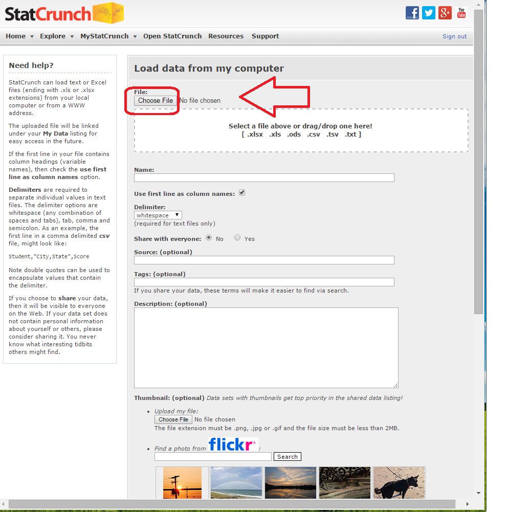
- Click on "Select a file on my computer" (see images below)
- Navigate to your downloads folder and select "Databank.xlsx"
- Scroll to the bottom of the page and click on "Load File"
Click on "Select a file on my computer" (see images below)

Click on "Choose File" (see image below)
Scroll to the bottom of the page

Click on "Load File" (see image below)


Step 2 Make a Percentage Cumulative Frequency Distribution (table) with the Age Variable
- Click on the "Stat" dropdown menu. Hover over "Tables." Click on "Frequency" (see images below)
- In the "select column(s)" box, select/click the age variable.
- In the "Statistic(s)" box, select/click "Cumulative percent of total."
- Check the "Output" box item "Store output in data table."
- Click on "Compute" (see images below)
- CLICK CANCEL on the warning message box the asks "Want to turn on binning for this procedure?"
Click on the "Stat" dropdown menu. Hover over "Tables." Click on "Frequency"

In the "select column(s)" box, select/click the age variable.

In the "Statistic(s)" box, select/click "Cumulative percent of total."

Check the "Output" box item "Store output in data table."

Click on "Compute" (see images below)

CLICK CANCEL on the warning message box the asks "Want to turn on binning for this procedure?"

The cumulative percent distribution table for the age variable is then added to your spreadsheet. Use your horizontal scroll bar to find it and see that it has been created. Next, you will graph this table (as an ogive).

Step 3 Graph the Cumulative Percentage Frequency Table (Ogive)
- Click on the "Graph" dropdown menu. Hover over "Scatter Plot." Click on "Scatter Plot" (see images below)
- Set the X variable to "age."
IT IS CRITICALLY IMPORTANT THAT YOU SELECT THE SECOND AGE VARIABLE THAT APPEARS IN THE DROPDOWN LIST
Set the Y Variable to "Cumulative Percent of Total" - Set the "Display" variable to "Lines."
- Scroll down a bit. Set the "Graph Properties" variables as follows:
- Color Scheme: Basic 7 Colors
- X-axis label: Ages of Respondents
- Y-axis label: Percentile
- Title: Age Ogive by (insert your name)
- Check mark both "Horizontal Lines" and "Vertical Lines."
- Click on "Compute"
- Click on the at the lower left corner of the graph.
- Select "X-axis."
- Set the "Edit X-axis" form as follows:
- Minimum: 15
- Maximum: 75
- Label: Ages of Respondents
- Tick Marks: 15,20,25,30,35,40,45,50,55,60,65,70,75
- Additional vertical lines: 15,20,25,30,35,40,45,50,55,60,65,70,75
- Click "okay."
- Click on the at the lower left corner of the graph again.
- Select "Y-axis."
- Set the "Edit Y-axis"form as follows:
- Minimum: 0
- Maximum: 105
- Label: Percentile
- Tick Marks: 5,10,15,20,25,30,35,40,45,50,55,60,65,70,75,80,85,90,95
- Additional vertical lines: 5,10,15,20,25,30,35,40,45,50,55,60,65,70,75,80,85,90,95
- Click "okay."
- Click on the to expand the graph
- Click the "Options" button located on the top right corner of your graph. Click "print."
Click on the "Graph" dropdown menu. Hover over "Scatter Plot." Click on "Scatter Plot"

Set the X variable to "age."
IT IS CRITICALLY IMPORTANT THAT YOU SELECT THE SECOND AGE VARIABLE THAT APPEARS IN THE DROPDOWN LIST
Set the Y Variable to "Cumulative Percent of Total"

Set the "Display" variable to "Lines."

Scroll down a bit. Set the "Graph Properties" variables.
- Color Scheme: Basic 7 Colors
- X-axis label: Ages of Respondents
- Y-axis label: Percentile
- Title: Age Ogive by (insert your name)
- Check mark both "Horizontal Lines" and "Vertical Lines."

Click on "Compute"


Click on the at the lower left corner of the graph.

Select "X-axis."

Set the "Edit X-axis" form as follows:
- Minimum: 15
- Maximum: 75
- Label: Ages of Respondents
- Tick Marks: 15,20,25,30,35,40,45,50,55,60,65,70,75
- Additional vertical lines: 15,20,25,30,35,40,45,50,55,60,65,70,75
You will have use a different max and min for the systolic variable. Your vertical lines and tick marks of your graph's grid need to be from the min (of the systolic variable) to the max and separated by 5.

Click "okay"


Click on the at the lower left corner of the graph again. Select "Y-axis."

Set the "Edit Y-axis" form as follows:
- Minimum: 0
- Maximum: 105
- Label: Percentile
- Tick Marks: 5,10,15,20,25,30,35,40,45,50,55,60,65,70,75,80,85,90,95
- Additional vertical lines: 5,10,15,20,25,30,35,40,45,50,55,60,65,70,75,80,85,90,95

Click "okay."

Click on the to expand the graph

Click the "Options" button located on the top right corner of your graph.

Click "print."
